
The project at a glance
ACTV8 PRO is a website for a defined professional audience: doctors and other healthcare professionals working with the company's product lines. The project was delivered for a Swiss company based in Lugano. The website brings its brand presentation, professional information, product catalogue and customer account into one environment.
The ITHOUSE team delivered the interface design, development, Commerce integration, Stripe integration and support. The client supplied the content. This case is presented in the IT House Lab portfolio as a project from the ITHOUSE practice behind the brand.
The website launched in 2025. The screens in this case show the interface reviewed in October 2026. Company identifiers and commercial figures have been removed from the presentation images. Account images use a fictional identity to protect personal information.
Website: actv8pro.com ↗
A clear boundary between visitors and professional users
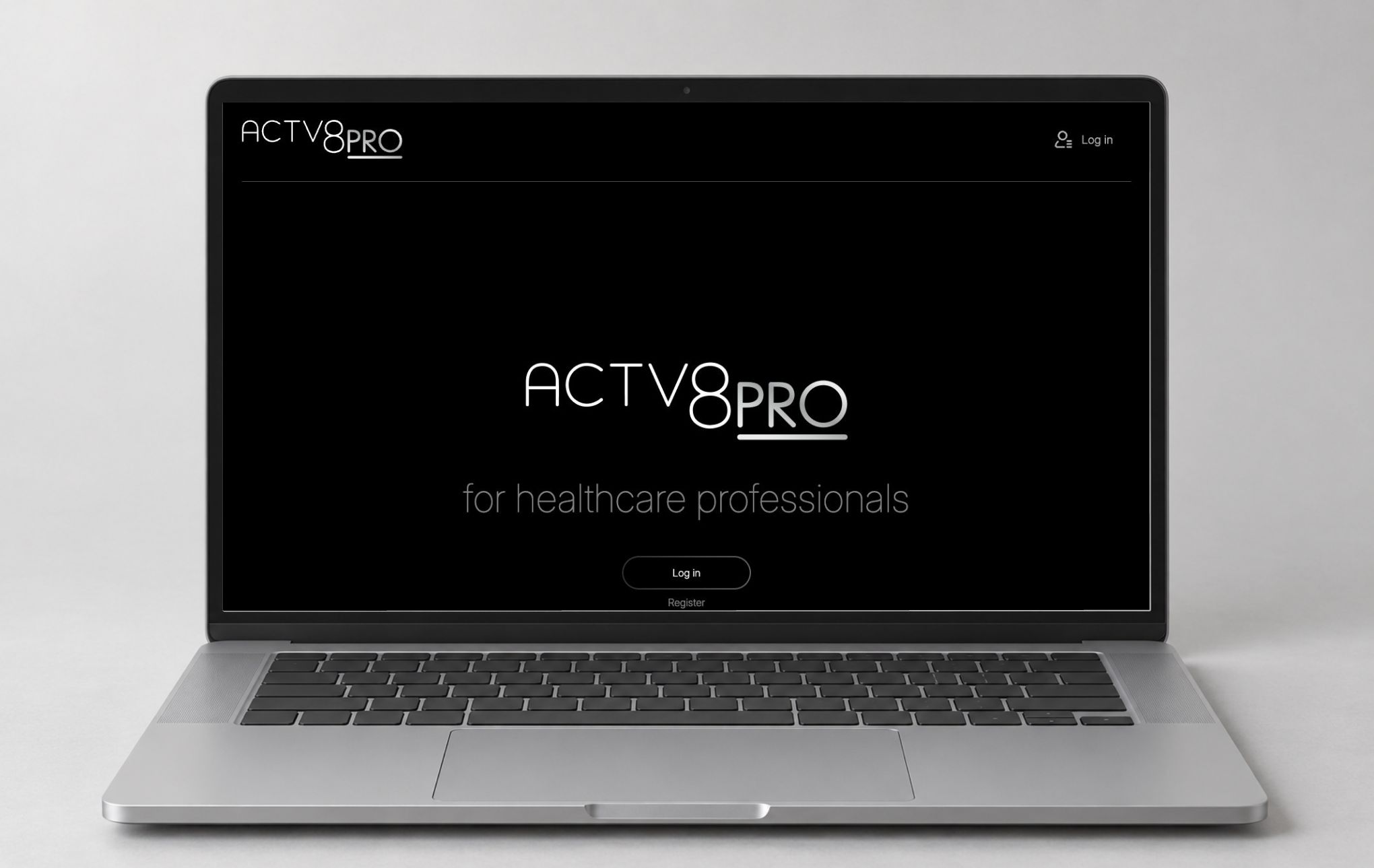
The public homepage establishes the brand and its audience before introducing a product catalogue. Its central message, “for healthcare professionals”, is supported by two direct entry points: sign in and registration.
After signing in, the experience expands. The navigation includes the technology page, scientific support, before-and-after content, the shop and frequently asked questions. A basket indicator and account access connect these sections to the customer's working area.
This distinction shapes the website's structure. Open content explains who the website is for. The authenticated experience gives professional users the product information and account tools relevant to them. Product access is available after sign-in.
 Open full screen ↗
One platform for several connected tasks
A professional visitor may arrive to learn about the technology, review a product, return to the basket or manage account information. Those tasks have different starting points, but they belong to the same website.
The primary navigation gives each main area a direct route. Product pages link back to the shop through breadcrumbs. The basket remains accessible from the header and footer. The account menu groups personal information and order access, while the profile area adds tabs for viewing information, payment methods, editing and orders.
The structure gives the professional materials and the purchasing screens distinct places within the platform. A reader can explore the client's materials, move to a product page and return to the basket within the same visual system.
A restrained visual language for a specialist brand
The interface uses a black-and-white foundation, fine typography and generous space. Large headings establish the page subject. Light rules and outlined controls organise information without competing with product photography.
Inter is used throughout the observed interface. Thin and light weights give the brand presentation a distinct character, while product names and field values use clearer emphasis where the reader needs to make a decision.
The client's wordmark and product imagery carry the identity. A dark header and footer frame lighter content areas. Product images remain the visual anchor of the catalogue and detail pages; the surrounding interface stays neutral.
The homepage introduces the professional environment
The public first screen focuses on the ACTV8 PRO wordmark and professional audience. The sign-in and registration controls are easy to identify within that composition.
For signed-in users, the homepage also introduces the client's content programme. The observed interface includes a webinar feature, the technology presentation, product-related content and a latest-news section. These modules create several routes into the website beyond entering the shop directly.
The brand presentation and professional materials use the same header, typography and control language as the commercial pages. That consistency connects the editorial and purchasing areas of the platform.
 Open full screen ↗
A catalogue that gives each product room to be understood
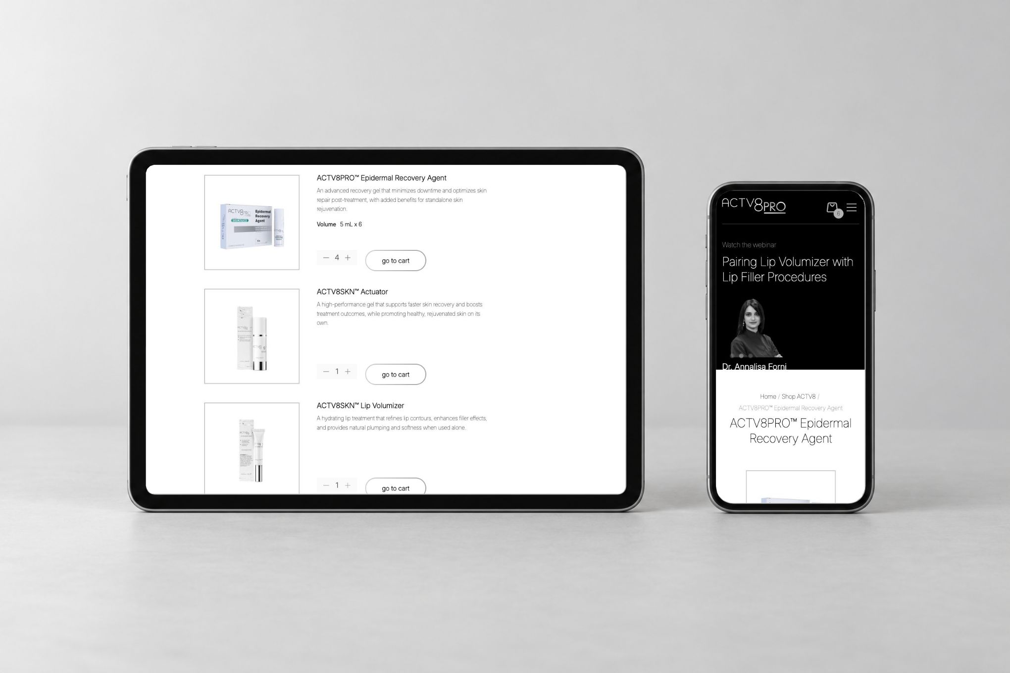
The shop presents products as a vertical sequence of structured rows. Each row pairs a pack shot with its name, a short description and purchasing control. The layout makes it possible to compare the products while keeping their individual information readable.
At the time of review, the catalogue included ACTV8PRO™ Epidermal Recovery Agent, ACTV8SKN™ Actuator, ACTV8SKN™ Lip Volumizer and ACTV8SKN™ Eye Contour. The first product also showed its pack volume alongside the overview.
These names and descriptions belong to the client's content. The interface design gives them a consistent place: image, identification, summary and action appear in a repeatable order. Product links lead to a fuller explanation when a brief overview is not enough.
 Open full screen ↗
The catalogue reflects the existing basket
The observed product rows distinguish between items already in the basket and an item that can be added. Existing items show their current quantity and a direct “go to cart” link. The remaining product shows an “Add to cart” control.
That difference makes the current state visible from the catalogue itself. A returning customer can recognise that a product is already part of the basket and move to its summary without leaving the product context to search for it.
The images show the basket state that already existed in the supplied account. No products or quantities were changed to prepare this case.
Product pages establish a detailed reading order
The product page starts with breadcrumbs and the product name, then pairs the product image with a fuller description. In the Epidermal Recovery Agent page reviewed for this case, the information is divided into labelled sections, including volume, short description, indications, benefits, ingredients and use.
The labelled sections provide clear entry points for scanning the content. A specialist can locate the category of information they need while retaining the context of the product image and name.
The basket control forms a distinct part of the page. Additional technology and ingredient content follows beneath the main product information. The page therefore supports both a quick product overview and a more detailed reading.
All scientific and product content was provided by the client. This case focuses on the organisation and reading order of that information in the interface.
 Open full screen ↗
Professional information has its own place in the website
The scientific-support area groups the client's materials into recognisable sections. The observed page includes product booklets, protocols, articles and webinars, alongside other professional content.
The distinction between these categories is visible through section headings and repeated content previews. Titles act as entry points to the corresponding material. A professional user can approach the library by the type of information they need.
The technology page and frequently asked questions provide additional reading routes. Together with the shop, these sections support a website where product information and the client's professional materials remain close to one another.
 Open full screen ↗
The account is a compact working area
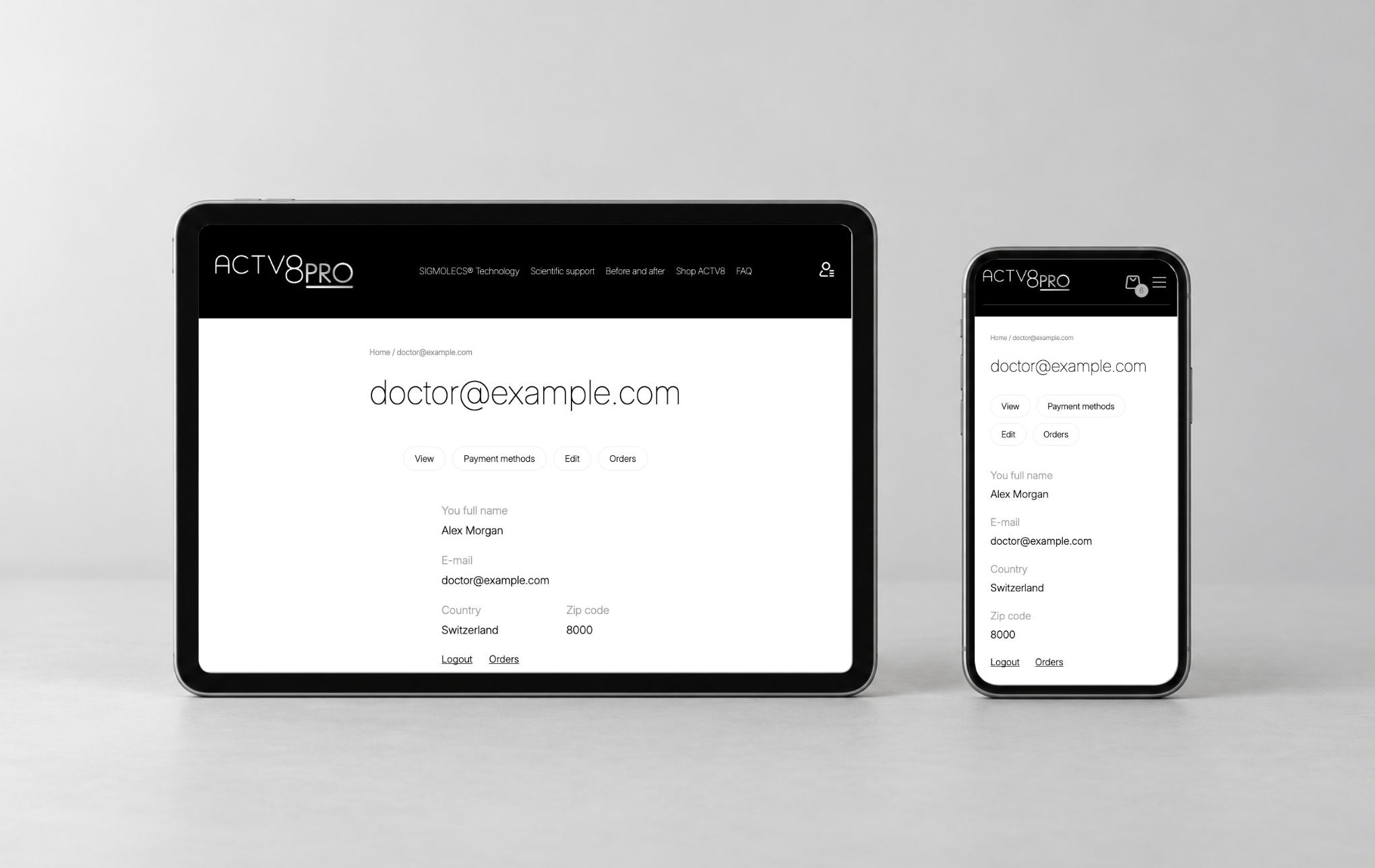
The account overview uses a simple field hierarchy. Labels identify the full name, email, country and postal code; values are placed directly beneath them. The relationship between a label and its value remains clear without requiring a dense table.
Above the profile information, the account tabs group four destinations: View, Payment methods, Edit and Orders. The account menu also provides direct routes to personal information and orders.
These entry points make the account's main functions visible together. The profile overview remains focused on the current user's information, while the other tabs provide routes to their respective areas.
For this presentation, the original field markup and theme styles were retained in a local privacy copy. The name, email, country and postal code were replaced with fictional demonstration values. The live profile was not edited. No personal order details or saved payment information are shown.
 Open full screen ↗
A basket with a readable summary
The basket page presents product lines and quantities in a structured layout. The route to checkout is kept separate from the individual product rows. Commercial figures are omitted from the publication images.
The observed basket already contained three product lines and six units. This existing state allowed the interface to be documented without adding products, changing quantities or creating an order.
The controls for removing a line, updating the basket and proceeding to checkout are visible within the interface. Their placement makes the available actions clear and supports the connected product-to-basket route.
 Open full screen ↗
Mobile layouts preserve the information hierarchy
Phone presentations use the website's responsive layout at a 390-pixel viewport, with company identifiers and commercial figures omitted. They show the homepage, open navigation, catalogue, product page and basket. The account presentation uses the same fictional identity as the desktop version.
The mobile header combines the wordmark, basket indicator and menu control. Opening the menu reveals the main content sections, search interface and account destinations in one vertical panel.
The catalogue and product content adapt to the narrower width. Information is presented in a vertical reading sequence, with product imagery, names and controls taking their own space. The basket becomes a longer vertical page on a phone.
The mockups use these presentation captures. They show the responsive interface inside a device frame, with the underlying screen available separately in the gallery.
 Open full screen ↗
 Open full screen ↗
Tablet layouts bridge the two reading formats
Tablet screens were reviewed in landscape at 1180 × 820 and portrait at 820 × 1180. The captures cover the catalogue, product page, basket and account presentation.
The wider layout retains space for product imagery and information to sit beside one another. The portrait view gives the same material a taller reading area. The interface's typography, outlined controls and content grouping remain recognisable across both orientations.
The tablet mockup uses a presentation capture of the corresponding responsive layout. The device composition preserves the proportions and text of the actual screenshot.
Drupal, Commerce and Stripe within one delivery scope
The website's observed frontend uses a custom Drupal theme. Commerce provides the commercial interface represented by the product pages and basket. Stripe integration was part of the delivered project scope, as confirmed by the project owner.
Our scope connected interface design, development and integration. The client supplied the content, while the team implemented the website and its commercial components and provided support.
The technical foundation matters because the same platform carries the professional content, products and account experience. The visitor sees a consistent interface as they move between those areas.
Client content, structured for use on the website
The client provided the text and materials for the project. The website needed to give that content clear places within the page templates: homepage features, product summaries, detailed product sections, library categories and frequently asked questions.
The design work is visible in how those different content types are organised. A product overview is short and paired with a purchasing control. A product detail page uses labelled sections. A library item is introduced through its title and preview. The account follows a field-and-value pattern.
Each format serves a different task while keeping the same typography and visual language. The content and the page templates work together within the overall interface.
Support was included beyond the initial launch
The confirmed project scope included support alongside the 2025 launch. The website combines content pages, authenticated access, commercial screens and an integrated payment component, so maintaining the platform belongs to the same delivery context as building it.
This case shows the interface in its current reviewed state. It presents the delivered structure and the visible user experience.
What the project delivered
The result is a professional website for a Swiss client with a clear audience and connected content and commercial areas. The delivery includes interface design, development, Commerce integration, Stripe integration and support, using content supplied by the client.
The visible experience connects the public introduction, authenticated navigation, catalogue, product details, professional materials, account and basket. Desktop, phone and tablet views retain the same identity while adapting the presentation to the available space.
For IT House Lab, the project demonstrates experience with a specialist international website where content, professional access and commerce need to work within one scope.
Explore the screens
The gallery includes large desktop, phone and tablet captures, together with photorealistic device presentations. Publication-approved presentation captures are available at full size for close inspection. Account images are explicitly marked as privacy copies with fictional data.
Screens present the interface reviewed in October 2026, with company identifiers and commercial figures omitted. Account images use fictional demonstration data.
Build a professional platform around your buyers
Tell us who your website serves, which information helps them choose a product and which account or purchasing tasks the platform needs to support. We can bring interface design, development and integration into a defined scope for your project.
Discuss your project with IT House Lab: info@ithlab.tech.


